The form has been successfully submitted.
Please find further information in your mailbox.
Innowise redesigned a mobile app for both Apple AppStore and Google Play Store, resulting in a significant increase in downloads and a substantial boost in revenue.
Our client owns a distinguished ski resort nestled in Italy’s picturesque landscapes, renowned for its expansive skiing terrains and dedicated to delivering an unparalleled experience for sports enthusiasts.
Detailed information about the client cannot be disclosed under the terms of NDA.
The client had a cutting-edge mobile application for ski holidays, cycling, and hiking designed to enhance visitors’ experience in exploring the breathtaking mountain range. Developed with a user-centric approach, the application served as a comprehensive digital guide, providing essential information, interactive maps, and personalized recommendations for the region’s outdoor activities, hiking trails, and tourist attractions. The app offered real-time weather updates, detailed trail descriptions, difficulty ratings, and elevation profiles to help hikers plan their adventures effectively.
The application also integrated GPS functionality, enabling users to track their routes and navigate the mountainous terrain easily. The users could share their experiences, tips, and photos, fostering a sense of camaraderie among outdoor enthusiasts.
But at the time when our client came to us, their mobile apps on Google Play Store and Apple AppStore were antiquated in design and functionality, resulting in low ratings. The primary issue was the old-fashioned and unwieldy UI that provided many clients with a negative user experience. Additionally, the app was affected by performance issues, recurring crashes, and an overcomplicated user flow, contributing to user dissatisfaction.
The client entrusted us to make an application redesign for users for the winter 2023/2024 season.
Our developers kicked off the project with a UI/UX redesign based on wireframes created in Figma and Sketch by designers on the client’s side, which proved to be dynamic tools for this task. However, keeping in tune with the client’s evolving needs, these wireframes weren’t set in stone. We kept tweaking them, ensuring that each iteration was a step closer to what the client envisioned. This iterative process was essential in ensuring that the app’s look and feel resonated with the end-users while staying aligned with the client’s brand.
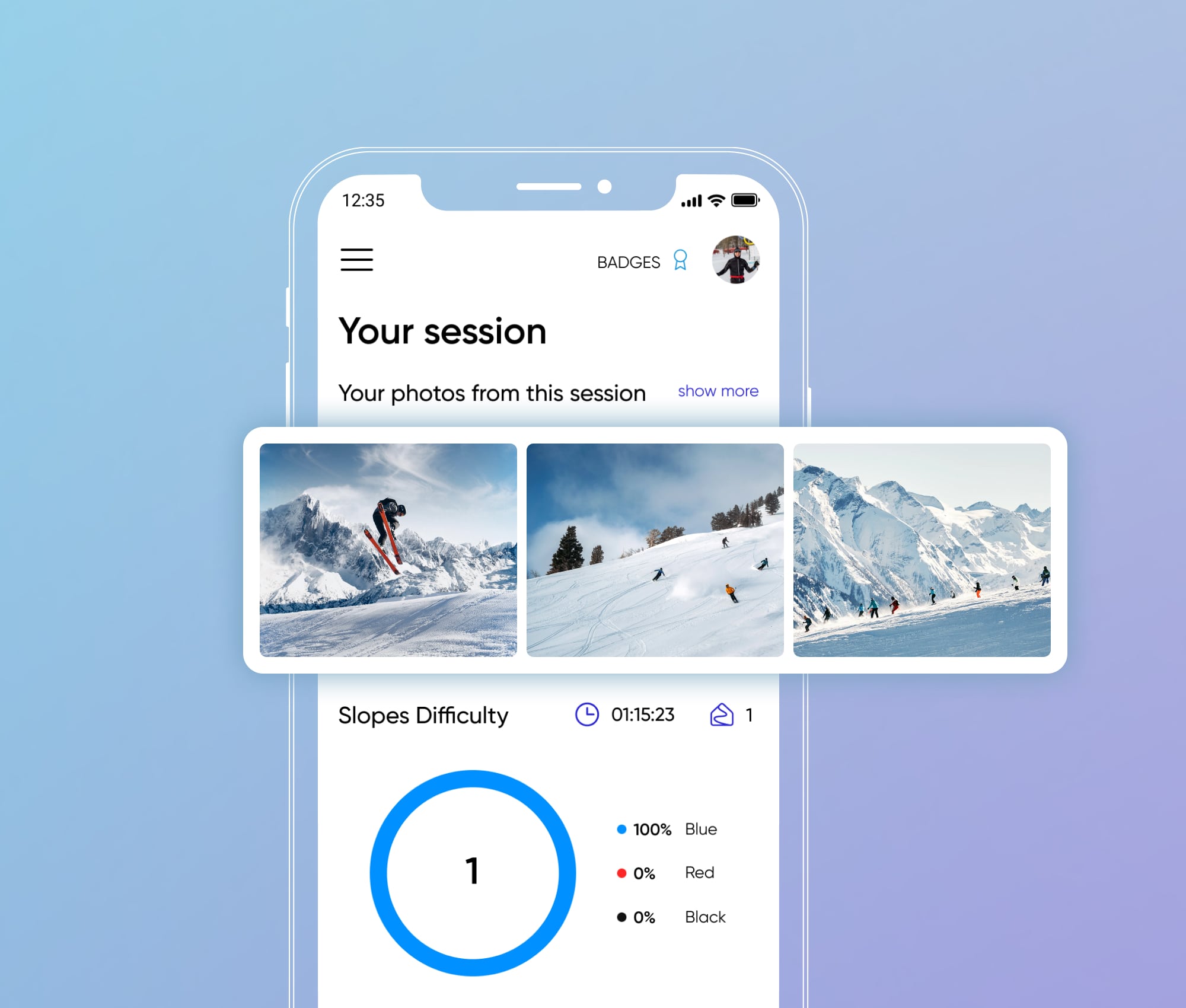
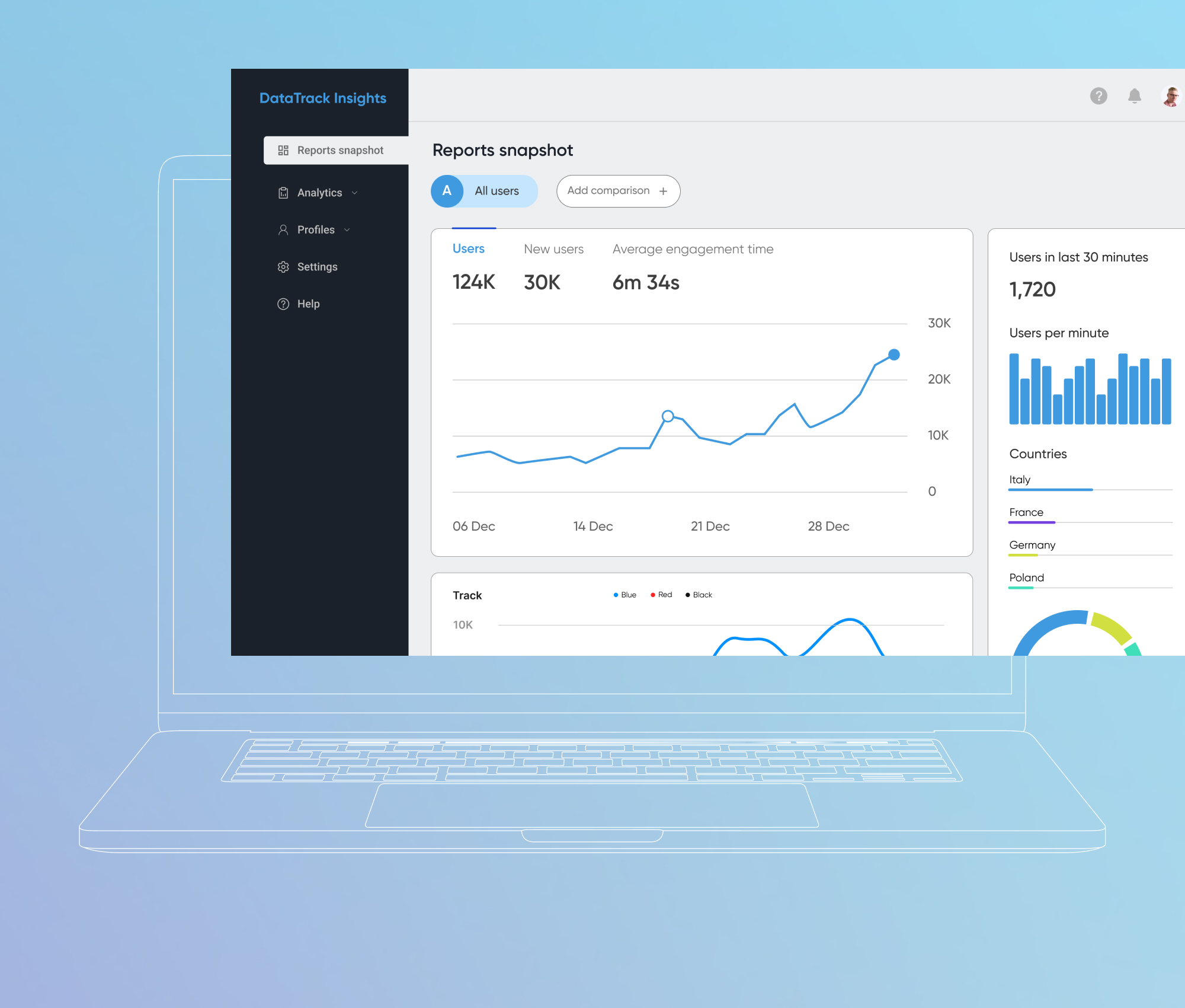
We revised the news and statistics screens to make them more informative and visually appealing. We also added more useful information to the tracking screen to provide the users with the opportunity to improve their results with the intermediate statistics.
For instance, the statistics screen showcases a wealth of data now – like the number of slopes used, which kind of lifts were frequented, the average speed of skiers, and even the number of sharp corners taken. This wasn’t just data for the sake of data; it was about providing meaningful insights to users and enhancing their skiing experience.
Managing personal information in the user profile screen has become more intuitive and convenient.
We aimed to make the app easy to navigate. We mapped the user journey, identifying any points where users might hit a snag. Then, we smoothed these out, creating an intuitive and user-friendly flow. We radically redesigned the user settings menu and added pop-up windows that could be compressed or expanded depending on the amount of information the user wishes to display. Additionally, our team implemented convenient and large buttons that are easy to press even with frozen fingers. This meant that users could find what they wanted quickly and efficiently, without any guesswork.
We didn’t just stop at a visual makeover; our team delved into the app’s core business logic. The key here was to keep the app essence intact – meaning, no significant changes to its fundamental functionality and features. However, we knew that for the app to stand out, it needed to be faster and more efficient. So, we optimized the business logic, smoothing out any kinks that could cause delays or memory leakages.
This optimization was like giving the app a new engine, one that ran smoother and faster, enhancing the overall user experience. To achieve these perfect results, our team optimized algorithms and data structures to improve performance. Furthermore, we rewrote the network request and image management layers, fixed all memory leaks, configured lazy resource loading, and implemented asynchronous operations. Then we connected modern real-time performance monitoring tools with tools such as Crashlytics and Firebase Performance Monitoring to quickly respond to the slightest of issues.
Moreover, we placed a strong emphasis on app stability, transcending mere bug fixes to future-proof the application. Our team scrutinized the code, identifying and fixing potential weak spots.
This proactive approach ensured that the app wouldn’t just perform well at launch but would continue to do so in the long run.
We took the app experience up a notch by rolling out support for the Apple Watch. This move was more than just keeping pace with the latest tech trends; it’s a significant leap forward in statistics gathering. With Apple Watch integration, users can track their ski runs and hiking activities right down to their pulse during an exhilarating descent or breathtaking mount climbing. This means users get more accurate and insightful data about their slope activities. It’s a deep dive into understanding not just the numbers but the entire extreme experience of users. By beefing up the app with this feature, we enhanced the app’s personal touch and made every bit of data collected more impactful and user-centric.
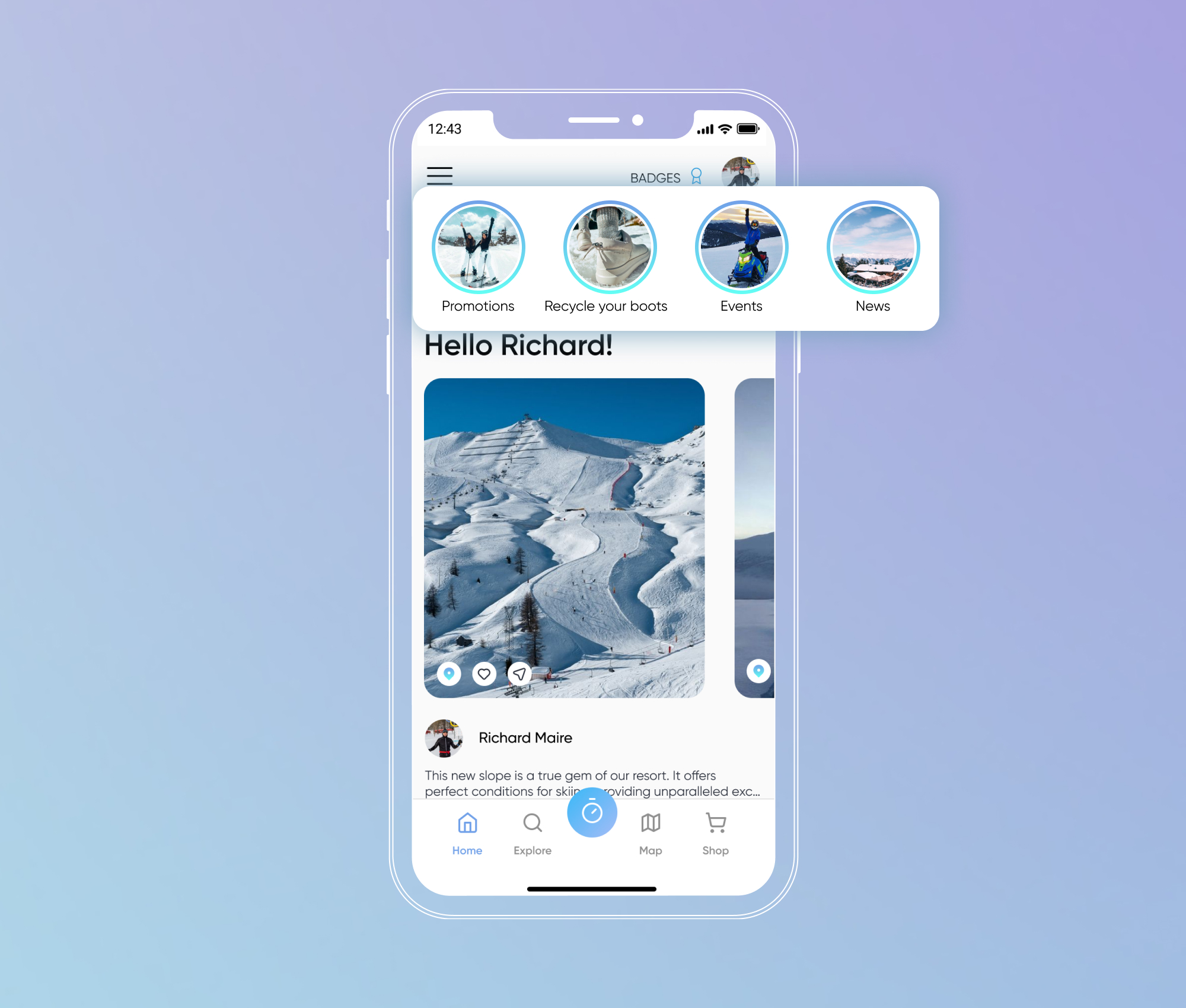
As part of our comprehensive app redesign, we strategically integrated ‘stories’ – a dynamic feature aimed at enhancing user engagement and knowledge sharing. These stories entertain and serve as a valuable channel for insights and updates. By introducing this engaging storytelling element, we’ve transformed the app into a multifaceted platform that fulfills functional needs and also delivers entertainment and informative content, ultimately contributing to increased user engagement and retention.
We incorporated detailed unit tests to scrutinize each app component, ensuring every part functioned flawlessly. Furthermore, we integrated continuous integration / continuous deployment (CI/CD) into our development process. This approach reflects our commitment to quality control and adherence to best practices in software development.
To achieve these objectives, we leveraged a solution tailored for tasks including:
This integration meant that our updates and improvements were consistently tested and deployed on time, keeping the app up-to-date without hitches. This ensured the app was user-friendly, robust, efficient, and constantly evolving.
Android
iOS
MVVM+C, Swift + Combine, iOS SDK, WatchKit, Xibs / SnapKit, GCD, CocoaPods, KeychainAccess, URLSession, MapKit, CoreLocation. Common: Mapbox, Storyly, RevenueCat, Gleap, SonarQube
Back end
Design
Services
Firebase (Analytics, Crashlytics, Cloud Messaging, App Distribution), GitLab, Jira, Confluence, Strapi, MS Teams
AQA
We began with Kanban, appreciated for its simplicity and ongoing delivery. As project complexity rose, we smoothly transitioned to Scrumban, a blend of Scrum and Kanban. This move integrated Kanban's adaptability with Scrum's structured planning, enabling efficient weekly release cycles and rapid adaptation to changing requirements.
These meetings were crucial to our project management strategy, ensuring the team remained aligned on daily objectives and promptly addressed emerging issues. Regular communication during these meetings fostered a cohesive team environment and effective issue resolution.
This approach was used by our team to improve productivity, share knowledge, and enable collaborative problem-solving. Participants, together with the customer’s team, were completely immersed in solving the problem, exchanging ideas, experiences, and solutions. All the integrations of new functionality occurred in real time, which allowed us to make decisions and try new solutions quickly.
Microsoft Teams was our primary communication tool for sharing updates and conducting daily/monthly meetings. Its effective utilization helped us to enhance team collaboration and ensure consistent information flow among team members.
Jira served as our primary task management tool. Team members tracked their 8-hour workdays with concise task descriptions for transparency and efficiency. Jira's reminder and alert features helped maintain our schedule integrity and manage workloads effectively, contributing significantly to the project's success.
1
Project Manager
1
Lead iOS+Android Engineer / Solution Architect
1
Lead Android Engineer
1
Lead iOS Engineer
2
Senior Android Engineers
2
Senior iOS Engineers
Our comprehensive application redesign led to genuinely transformative results. First, we revamped the app’s design to make it more appealing and user-friendly. We also developed new user flows to enhance the app journey. This change meant that users could easily navigate the app, finding what they needed without hassle. From opening the app to engaging with advanced features, the journey became smoother, making the entire experience more enjoyable. We enhanced the existing features and optimized business logic. In addition to its intelligent features, the app operated with increased speed. This optimization elevated the overall user experience.
The technical side saw significant upgrades, too. We updated the entire codebase, removing outdated libraries and dependencies that held the app back. This step was crucial to ensuring the app’s long-term performance and reliability. Speaking of performance, we conducted a full review to ensure the app operated efficiently under heavy loads. This comprehensive performance check was instrumental in identifying and addressing any lingering issues.
The results of these efforts were remarkable. We saw a staggering 90% reduction in application crashes, a clear indicator of the app’s enhanced stability and reliability. Moreover, the app’s user base expanded significantly, with an impressive increase of 30,000 users within the first two weeks post-launch.
30.000
downloads within the first two weeks post-launch
90%
reduction in application crashes
Having received and processed your request, we will get back to you shortly to detail your project needs and sign an NDA to ensure the confidentiality of information.
After examining requirements, our analysts and developers devise a project proposal with the scope of works, team size, time, and cost estimates.
We arrange a meeting with you to discuss the offer and come to an agreement.
We sign a contract and start working on your project as quickly as possible.
© 2007-2024 Innowise. All Rights Reserved.
Privacy Policy. Cookies Policy.
Innowise Sp. z o.o Ul. Rondo Ignacego Daszyńskiego, 2B-22P, 00-843 Warsaw, Poland
By signing up you agree to our Privacy Policy, including the use of cookies and transfer of your personal information.
Thank you!
Your message has been sent.
We’ll process your request and contact you back as soon as possible.
Thank you!
Your message has been sent.
We’ll process your request and contact you back as soon as possible.