










































Data visualization services

Still wrestling with complicated spreadsheets? Innowise transforms buried insights into boardroom clarity through clear, interactive dashboards that help teams spot trends, reduce risk, and act faster than your competition.

100+

data projects delivered

60+

data visualization experts

80%

senior & mid-level specialists

Still wrestling with complicated spreadsheets? Innowise transforms buried insights into boardroom clarity through clear, interactive dashboards that help teams spot trends, reduce risk, and act faster than your competition.

100+

data projects delivered

60+

data visualization experts

80%

senior & mid-level specialists

The real-world data visualization problems we solve

Fixing slow report delivery Faster time to market icon.
Late reports are useless for businesses, so we build auto-updating dashboards and pipelines that deliver insights when you need them, not hours later. Faster time to market icon.
Scaling with growing data Productivity icon.
Data’s piling up? Instead of patching performance, we redesign your model and establish an architecture that scales effectively without painful rework. Productivity icon.
Enabling self-service insights Productivity icon.
While some teams rely on analysts for every number, Innowise makes dashboards intuitive enough that even non-tech folks can dig in and find what they need. Productivity icon.
Cleaning up messy integrations Data security icon.
Pulling info from dozens of standalone systems? We clean up the integration mess and build data layers that merge info into one reliable source of truth.
Restoring trust in reporting Private bank icon.
Innowise helps you win users’ trust back. We add audit trails, calculation explanations, and test every logic layer, so your team can truly rely on the numbers. Private bank icon.
Driving BI user adoption
No one uses clunky dashboards. So ours are fast, clean, and tailored to defined roles. Plus, we offer user guides to make adoption as painless as possible.

Innowise’s end-to-end data visualization services

  • Data visualization consulting
  • Data visualization implementation
  • Data platform development
  • Custom software solutions
  • Dashboard and report design
  • Visualization optimization
  • Data visualization with cloud services

No dashboards? Or worse — ones no one uses? We help you start from zero or clean up the mess, building a clear, practical plan to turn raw data into reports with real business insight.

Data visualization consulting.

Data visualization implementation

Whether you need to pick the right stack or wire up real-time dashboards, Innowise’s team handles the hands-on work of making visualizations accurate and actually worth using.

Data visualization implementation.

Data platform development

Experienced in data engineering solutions, we build a solid foundation first, like pipelines and warehouses. Your visualizations pull from reliable data instead of mismatched sources.

Data platform development.

Custom software solutions

Need to go beyond off-the-shelf? We build custom data visualization apps with embedded dashboards that connect to your data and work exactly the way your users expect them to.

Custom software solutions.

Dashboard and report design

Cutting through the noise, we design and develop dashboards that are truly built for specific roles, updated in real time, and shaped by what people need to make data-driven decisions.

Dashboard and report design.

Visualization optimization

Already have dashboards but they’re slow, cluttered, or unused? Innowise’s data experts audit the solution, fix performance issues, and redesign with a focus on clarity.

Visualization optimization.

Data visualization with cloud services

As a certified AWS, Azure, and GCP partner, Innowise builds scalable, secure data visualizations using cloud-native tools and adjusts their logic to the realities of your business.

Data visualization with cloud services.

Data visualization consulting

No dashboards? Or worse — ones no one uses? We help you start from zero or clean up the mess, building a clear, practical plan to turn raw data into reports with real business insight. Data visualization consulting.

Data visualization implementation

Whether you need to pick the right stack or wire up real-time dashboards, Innowise’s team handles the hands-on work of making visualizations accurate and actually worth using. Data visualization implementation.

Data platform development

Experienced in data engineering solutions, we build a solid foundation first, like pipelines and warehouses. Your visualizations pull from reliable data instead of mismatched sources. Data platform development.

Custom software solutions

Need to go beyond off-the-shelf? We build custom data visualization apps with embedded dashboards that connect to your data and work exactly the way your users expect them to. Custom software solutions.

Dashboard and report design

Cutting through the noise, we design and develop dashboards that are truly built for specific roles, updated in real time, and shaped by what people need to make data-driven decisions. Dashboard and report design.

Visualization optimization

Already have dashboards but they’re slow, cluttered, or unused? Innowise’s data experts audit the solution, fix performance issues, and redesign with a focus on clarity. Visualization optimization.

Data visualization with cloud services

As a certified AWS, Azure, and GCP partner, Innowise builds scalable, secure data visualizations using cloud-native tools and adjusts their logic to the realities of your business. Data visualization with cloud services.

Data visualization experts are just two clicks away

Where data visualization makes the biggest impact

  • Enterprise
  • Manufacturing
  • Supply Chain
  • Marketing and Sales
  • Finance
  • Recruiting & HR
  • Security
  • Retail
  • eCommerce
  • Healthcare
  • Transportation

Get a top-down view of KPIs, team performance, and resource allocation across enterprise departments to drive aligned decision-making at every level.

  • Cross-departmental dashboards
  • Executive and team-level views
  • Real-time performance tracking
Enterprise.

Visualize production metrics, downtime, and quality control in real time to detect inefficiencies and optimize every shift.

  • Machine performance charts
  • Yield & defect tracking
  • Downtime & maintenance trends
Manufacturing.

Track goods, delays, and inventory in action with dashboards that surface disruptions, optimize routing, and improve delivery.

  • Route and delivery monitoring
  • Inventory flow dashboards
  • Supplier reports
Supply Chain.

Unify campaign results, lead quality, and sales funnel metrics to spot what marketing strategies are working and how to push revenue higher.

  • Funnel and conversion charts
  • Channel performance tracking
  • Sales by region or rep
Marketing and Sales.

Monitor cash flow, margins, and forecasts in one place. Innowise turns complex financial processes into clear visuals for execs and investors.

  • Cash flow dashboards
  • Cost vs revenue breakdowns
  • Forecast vs actuals tracking
Finance.

Track hiring pipelines, turnover, hot vacancies, and team performance to help HR teams use smart visualizations, not dull monthly spreadsheets.

  • Hiring pipeline statistics
  • Employee retention trends
  • Workforce gaps analysis
Recruiting & HR.

Visualize threat patterns, system vulnerabilities, and response timelines to neutralize risks before issues escalate.

  • Security risk maps
  • Vulnerability tracking reports
  • Incident response time
Security.

Analyze sales trends, product performance, and foot traffic by location to spot underperformers, optimize inventory, and plan promotions smartly.

  • Store and SKU-level dashboards
  • Regional sales heatmaps
  • Promotion tracking
Retail.

Monitor sessions, conversion rates, and churn in real time with dashboards that highlight exactly where your business is at.

  • User journey visualizations
  • Cart and checkout metrics
  • Revenue by channel
eCommerce.

Track patient flows, lab test turnover, and outcomes with visual reports to improve care quality, reduce wait times, and allocate resources effectively.

  • Patient volume dashboards
  • Staff utilization tracking
  • Outcome and readmission data
Healthcare.

See route efficiency, fleet health, and fuel usage in a convenient report. Innowise’s team helps logistics teams operate faster and more cost-effectively.

  • Route and ETA dashboards
  • Vehicle diagnostics views
  • Fuel and cost breakdowns
Transportation.
ISO-9001
ISO-27001
ISO-13485
TUV
microsoft solution partners.
Google Cloud Partner.
Aws partner tier.
SAP Partner.
IBM silver partner.
UIpath partner.
Odoo
Shopify
Stripe Partner.
Salesforce Partner.
InterSystems Implementation Partner.
Databricks
ISTQB
Best Tech Evolution.
IAOP The_Global Outsoursing 100.
Clutch Outsourcing 2023.
Forbes Technology Council.
IAOP Strategic Partnerships 2022.
Clutch 100 Fastest Growth 2023.
HubSpot Partnership Provider.
Google Cloud Partner.
Aws partner tier.
Salesforce Partner.
microsoft solution partners.
IAOP The_Global Outsoursing 100.
ISO-9001
ISO-27001
ISO-13485
SAP Partner.
Shopify
InterSystems Implementation Partner.
Odoo
IBM silver partner.
UIpath partner.
Stripe Partner.
Databricks
ISTQB
Clutch Outsourcing 2023.
Clutch 100 Fastest Growth 2023.
Forbes Technology Council.
IAOP Strategic Partnerships 2022.
HubSpot Partnership Provider.
See all See less

Our data visualization methods and techniques

  • Core insights
  • Process & change analysis
  • Geospatial & density mapping
  • Flows & relationships
  • Distribution & drivers
  • Hierarchical views
  • KPIs & multi-variable analysis
  • Flow & time-series trends

Core insights

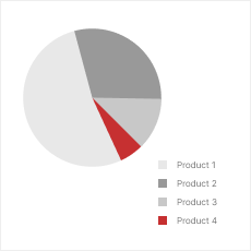
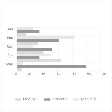
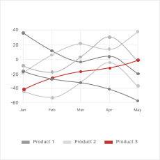
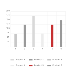
Use clear visualizations to highlight what matters most: KPIs, totals, trends, and product comparisons.

pie.

Pie chart

pie.

Bar chart

pie.

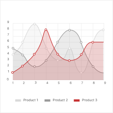
Line chart

pie.

Histogram

Process & change analysis

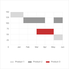
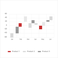
Map out progress, delays, and handoffs to see what’s holding up processes and what moves your business forward.

pie.

Gantt chart

pie.

Waterfall chart

pie.

Area chart

Geospatial & density mapping

Pinpoint where things are happening and visualize regional performance, traffic, or resource gaps.

pie.

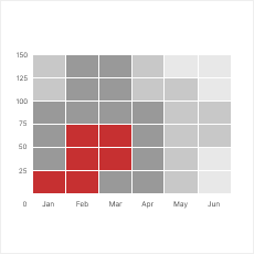
Heat map

pie.

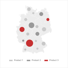
Choropleth map

Flows & relationships

Track conversion paths, drop-offs, or system dependencies to surface friction, influences, or weak links.

pie.

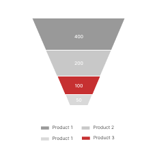
Funnel chart

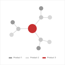
pie.

Network diagram

Distribution & drivers

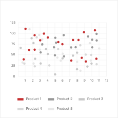
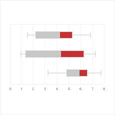
Spot outliers, clusters, and correlations using scatterplots, box plots, or matrices to understand what’s driving change and what’s just noise.

pie.

Scatterplot

pie.

Box and whisker plot

pie.

Correlation matrix

Hierarchical views

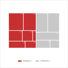
Drill into nested categories with data visualization tools to see how specific parts contribute to your whole business.

treemap.

Treemap

sunburst.

Sunburst

KPIs & multi-variable analysis

Monitor key metrics in context with charts that balance depth and clarity. No critical indicators will go unnoticed.

pie.

Bubble chart

pie.

Gauge chart

Flow & time-series trends

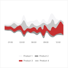
Visualize how values shift over time, between stages or categories. These dashboards are ideal for everything from budget flows to customer experience metrics.

pie.

Sankey chart

pie.

Streamgraph

Core insights

Use clear visualizations to highlight what matters most: KPIs, totals, trends, and product comparisons.
Pie chart.

Pie chart

Bar chart.

Bar chart

Line chart.

Line chart

Histogram.

Histogram

Process & change analysis

Map out progress, delays, and handoffs to see what’s holding up processes and what moves your business forward.
Gantt chart.

Gantt chart

Waterfall chart.

Waterfall chart

Area chart.

Area chart

Geospatial & density mapping

Pinpoint where things are happening and visualize regional performance, traffic, or resource gaps.
Heat map.

Heat map

Choropleth map.

Choropleth map

Flows & relationships

Track conversion paths, drop-offs, or system dependencies to surface friction, influences, or weak links.
Funnel chart.

Funnel chart

Network diagram.

Network diagram

Distribution & drivers

Spot outliers, clusters, and correlations using scatterplots, box plots, or matrices to understand what’s driving change and what’s just noise.
Scatterplot.

Scatterplot

Box and whisker plot.

Box and whisker plot

Correlation matrix.

Correlation matrix

Hierarchical views

Drill into nested categories with data visualization tools to see how specific parts contribute to your whole business.
Treemap.

Treemap

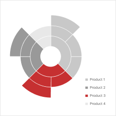
Sunburst.

Sunburst

KPIs & multi-variable analysis

Monitor key metrics in context with charts that balance depth and clarity. No critical indicators will go unnoticed.
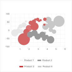
Bubble chart.

Bubble chart

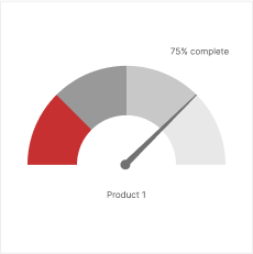
Gauge chart.

Gauge chart

Flow & time-series trends

Visualize how values shift over time, between stages or categories. These dashboards are ideal for everything from budget flows to customer experience metrics.
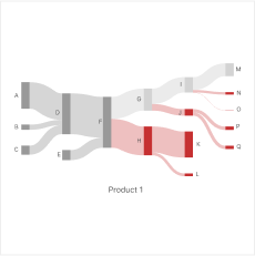
Sankey chart.

Sankey chart

Streamgraph.

Streamgraph

Looking for a data visualization service provider you can trust?

What powers our data visualization solutions

BI and data visualization tools
  • QlikView
  • Datawrapper
  • Cognos
  • Apache Superset
  • Metabase
  • Redash
Languages and frameworks
Libraries
  • Matplotlib
  • Plotly
  • Seaborn
  • Plotnine / GGplot
  • Bokeh
  • Pygal
  • Geoplotlib
  • D3.js
  • High Charts
  • Chart.js
  • Fusion Charts
  • Chartlist.js
  • Recharts
  • Google Charts
  • Dash
  • Streamlit
  • ggplot2
  • R Shiny
DWH services and databases
  • Microsoft SQL Server
  • PostgreSQL
  • MongoDB
  • MariaDB
  • MySQL
  • Clickhouse
  • Neo4j
  • Redis
  • Aurora
  • Redshift
  • RDS
  • Snowflake
  • DocumentDB
  • Synapse
  • Cosmo DB
  • Google BigQuery
  • Cloud Bigtable
Data storage
  • Amazon S3
  • Amazon DynamoDB
  • Amazon DocumentDB
  • Azure Cosmos DB
  • Azure Blob Storage
  • Azure Data Lake
  • Azure Data Factory
  • Google Cloud Datastore
  • Memorystore
Big data
  • Apache Hadoop
  • Apache Spark
  • Apache Cassandra
  • Apache Kafka
  • Apache ZooKeeper
  • Apache HBase

Why choose Innowise as a data visualization company

We don’t push generic tools, we build what fits your data, team, and pace. Innowise has worked with major enterprises and niche businesses to turn messy, underused data into daily decision power. As a data visualization solutions company, we focus on performance, long-term usability, and results for your business.

How we work with data

At Innowise, we craft an individual approach to your specific project and business to help you make the most of data analytics and visualization services. Usually, this is how the process looks like.

Collection
  • Connecting to all your data sources
  • Supporting APIs and databases
  • Gathering raw data
Cleaning
  • Fixing data issues and duplicates
  • Standardizing values and formats
  • Flagging suspicious entries
Parsing
  • Restructuring complex data fields
  • Classifying data into categories
  • Converting dates, metrics, etc.
Filtering
  • Defining the relevant data
  • Excluding noise and test records
  • Trimming datasets
Visualization
  • Picking charts that fit the goal
  • Designing clear reports
  • Building real-time, interactive views
Improvement
  • Enhancing visualizations post-launch
  • Adding new filters
  • Customizing dashboards further

What our customers think

Polina Shuruba Partner Manager XPRT MINDS
XPRT MINDS logo.

“Innowise is one of the best partners we have. They always fulfill our requests for qualified candidates. The team is very prompt.”

  • Industry IT services
  • Team size 6 specialists
  • Duration 24 months
  • Services HR consulting, staff augmentation
Dominik Märkl Director OneStop Pro
OneStop Pro logo.

“When it comes to handling pressure situations, Innowise has always proven their deftness in managing these situations. They do this by having clear understanding of our expected results to take our business towards growth and customer satisfaction.”

  • Industry Construction
  • Team size 7 specialists
  • Duration 36+ months
  • Services Custom software development
Stefania Basciu Delivery Director Topcon Agriculture
Topcon Agriculture logo.

“We are more than satisfied with our fruitful cooperation with Innowise, as they perform tasks in accordance with our high requirements and corporate standards and bring the desired results.”

  • Industry Consulting
  • Team size 2 specialists
  • Duration 28 months
  • Services Web development

FAQ

Yes, absolutely. Innowise’s data analytics solutions visualize both historical trends and predictive outputs to help you understand what’s happening and what to expect. That includes integrating forecast models, confidence intervals, and possible scenarios right into your dashboards.

Static charts show a snapshot, and interactive ones let you explore. We typically recommend interactive dashboards because they support filters, drilldowns, and real-time updates. That said, Innowise builds static visualizations too when speed or simplicity is the priority. The choice depends on how often the data changes, and we’re here to help you select the right visualizations.

With a data visualization firm like Innowise, pretty much everything is on the table. We tailor visuals by user role, industry context, and decision-making habits. Whether you need embedded dashboards or mobile views, we’ve done it.

Our engineers start by untangling the chaos, building staging layers, cleaning the mess, and organizing what matters. Then we translate that into sleek visuals. As a data visualization company, Innowise is used to working with data sets from various systems, like ERPs, IoT software, and legacy apps.

Yes, we build them to. Innowise offers data science as a service and plugs in machine learning outputs, real-time scoring, and anomaly detection directly into your dashboards. You’ll see AI predictions, patterns, and risk signals in context, powered by data science expertise.

Customer support icon.

Feel free to book a call and get all the answers you need.

    Contact us

    Book a call or fill out the form below and we’ll get back to you once we’ve processed your request.

    Send us a voice message
    Attach documents
    Upload file

    You can attach 1 file up to 2MB. Valid file formats: pdf, jpg, jpeg, png.

    By clicking Send, you consent to Innowise processing your personal data per our Privacy Policy to provide you with relevant information. By submitting your phone number, you agree that we may contact you via voice calls, SMS, and messaging apps. Calling, message, and data rates may apply.

    You can also send us your request
    to contact@innowise.com
    What happens next?
    1

    Once we’ve received and processed your request, we’ll get back to you to detail your project needs and sign an NDA to ensure confidentiality.

    2

    After examining your wants, needs, and expectations, our team will devise a project proposal with the scope of work, team size, time, and cost estimates.

    3

    We’ll arrange a meeting with you to discuss the offer and nail down the details.

    4

    Finally, we’ll sign a contract and start working on your project right away.

    More services we cover

    arrow