Legg igjen kontaktinformasjon, så sender vi deg oversikten vår på e-post
Jeg samtykker i å behandle personopplysningene mine for å sende personlig tilpasset markedsføringsmateriell i samsvar med Retningslinjer for personvern. Ved å bekrefte innsendingen samtykker du i å motta markedsføringsmateriell.
Takk skal du ha!
Skjemaet har blitt sendt inn. Mer informasjon finner du i postkassen din.
Innowise er et internasjonalt fullsyklus programvareutviklingsselskap grunnlagt i 2007. Vi er et team av IT fagfolk som utvikler programvare for andre fagfolk over hele verden.
Innowise er et internasjonalt fullsyklus programvareutviklingsselskap grunnlagt i 2007. Vi er et team av IT fagfolk som utvikler programvare for andre fagfolk over hele verden.
Kraften i datakartlegging i helsevesenet: fordeler, brukstilfeller og fremtidige trender. I takt med at helsevesenet og støtteteknologiene ekspanderer raskt, genereres det enorme mengder data og informasjon. Statistikk viser at om lag 301 Tp62T av verdens datavolum tilskrives helsevesenet, med en forventet vekst på nesten 361 Tp62T innen 2025. Dette indikerer at veksten er langt høyere enn i andre bransjer, som for eksempel produksjonsindustrien, finanssektoren og medie- og underholdningsbransjen.
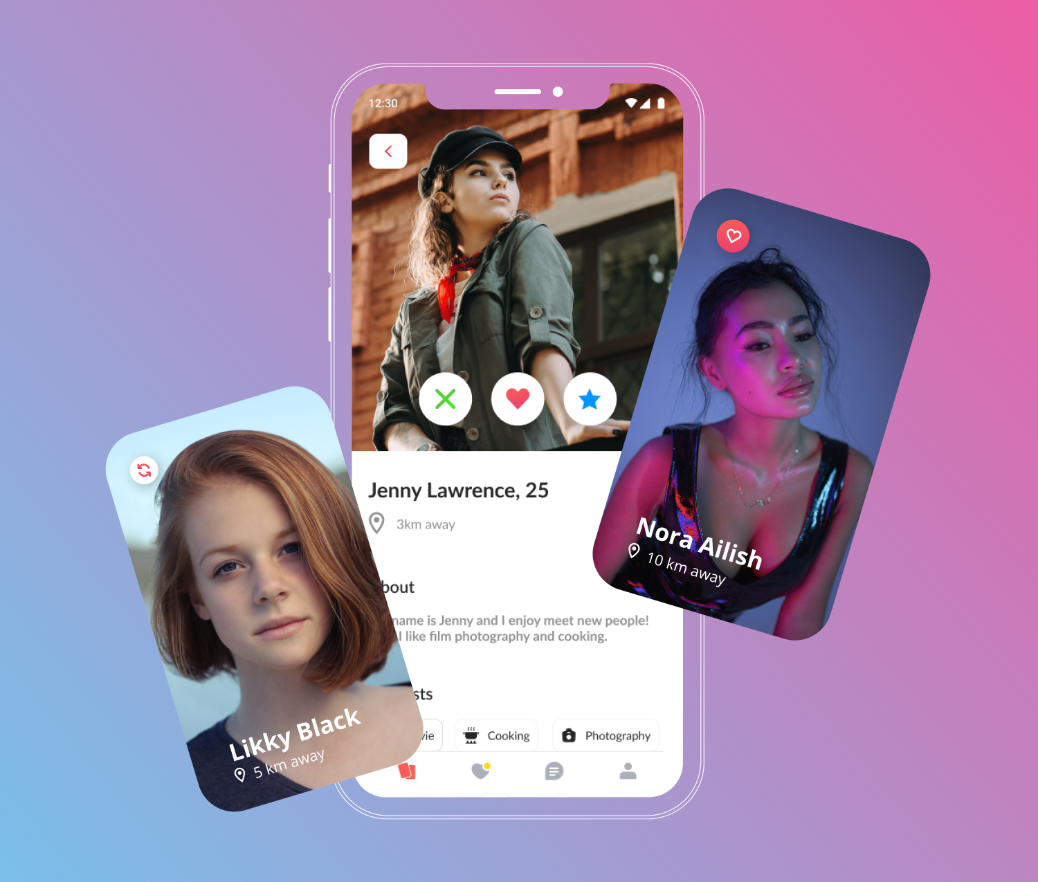
Hver gang noen spør meg hvordan man lager en app som Tinder, smiler jeg litt. På overflaten ser det jo enkelt ut: sveip til venstre, sveip til høyre, match, chat. Hvor komplisert kan det være?Vel, velkommen til kaninhullet.Å lage en datingapp handler ikke bare om å bygge en sveipemekanisme eller sette opp brukerprofiler. Det handler om å bygge et levende økosystem der brukeropplevelse, sanntidsytelse, personalisering og sikkerhet fungerer feilfritt sammen. Hvis ikke vil brukerne ikke bare sveipe til venstre på noen få profiler, de vil sveipe til venstre på hele appen din.Mulighetene her er enorme: Det globale markedet for nettdating er i kraftig vekst og forventes å nå nesten $3,45 milliarder innen 2029. Og det fine er at det fortsatt er god plass til nisjeplattformer, nye matchende modeller og innovative funksjoner som kan forstyrre markedet. Men (og det er et stort men) konkurransen er knallhard, og brukerne har ingen tålmodighet for klønete UX, trege swipes eller sikkerhetshull.I denne guiden går jeg gjennom den virkelige planen for hvordan du bygger en app som Tinder, fra å definere målgruppen din og velge teknologi til å bygge tillit til plattformen din fra dag én.Hos Innowise kjenner vi denne verdenen ut og inn. Teamet vårt har bidratt til å realisere flere ideer til datingapper, du får ekte erfaring, ikke bare teori. Jeg vil dele erfaringene vi har gjort, feilene du kan unngå, og de smarte grepene som vil gi deg langsiktig suksess.Ta en kaffe og sett deg godt til rette, du kommer til å takke deg selv senere.
Viktige læringspunkter
Forstå målgruppen din og skreddersy matchingslogikken slik at den passer til deres behov, enten det er gjensidige opt-ins eller kuraterte anbefalinger.
Velg riktig utviklingsvei: kloneskript for raske MVP-er, white-label-sett for fleksibilitet og tilpasset utvikling for skalerbarhet og kontroll.
Prioriter viktige funksjoner som sikker onboarding, brukerprofiler, sveipefunksjonalitet, sanntidschatt og smarte matchingsalgoritmer.
Optimaliser UX/UI for enkelhet og personalisering, med fokus på intuitiv design og rask onboarding for å forbedre brukerengasjementet.
Fokus på sikkerhet og skalerbarhet ved å implementere sterk kryptering, sikker autentisering og en teknisk stabel som støtter sanntidsytelse og geobasert matching.
Hvordan fungerer datingapper som Tinder?
Tinder fant ikke opp hjulet på nytt da det ble lansert. Det den gjorde, var å ta den rotete, ofte vanskelige prosessen med nettdating og komprimere den til noen få, vanedannende tommelbevegelser. Sveip til venstre hvis du ikke er interessert, sveip til høyre hvis du er det. Enkelt? Jada, men under panseret er det mye som skjer for å få denne enkelheten til å føles uanstrengt.
Apper som Tinder følger i bunn og grunn en ganske enkel flyt:
Du oppretter en profil.
Appen viser deg andre profiler basert på visse filtre (alder, sted, interesser).
Du sveiper.
Hvis to personer sveiper til høyre på hverandre, er det en match.
Nå kan dere chatte og (forhåpentligvis) møtes.
Men her er en ting ingen forteller deg: Den virkelige magien er ikke bare sveipingen. Det er matchende algoritme, den infrastruktur i sanntid, den optimalisering av geolokalisering, og sikkerhetsmekanismer bak kulissene. Hvis bare én brikke i puslespillet ikke fungerer som den skal - for eksempel hvis kampene føles irrelevante eller chattene er trege - mister du brukere raskere enn du kan si "super like".
Gjør datingapp-ideen din til den neste store greia folk elsker.
Nå som vi har kikket under panseret, la oss snakke om hva som skal til for å bygge en datingapp som folk vil elske og fortsette å bruke. Spoiler: Det handler ikke om å kopiere Tinder piksel for piksel. Det handler om å forstå hvorfor Tinder fungerer og finne ut hvordan du kan lage noe som føles like intuitivt, men som passer ditt unike publikum og dine mål.
Her er veikartet for å lage en dating-app som jeg anbefaler, basert på erfaring fra den virkelige verden.
1. Definer målgruppen din og matchende logikk
En ting av gangen: Du kan ikke lage en god datingapp hvis du ikke vet nøyaktig hvem du bygger den for.
Er det Gen Z som er ute etter fartsfylte kamper og meme-basert flørting? LHBTQ+-miljøer som trenger trygge, inkluderende arenaer? Religiøse single på jakt etter meningsfulle forhold? Yrkesaktive i alderen 35+ som er lei av å sveipe gjennom endeløs støy?
Hvert publikum har sine egne behov og forventninger. Og ja, toleranse for særegenheter.
Og målgruppen du velger, har direkte innvirkning på matchingslogikken du må bygge. Matchingslogikk er rett og slett systemet som bestemmer hvem som blir vist til hvem. Og det er kjernen i hele appopplevelsen. Noen populære modeller du kan låne eller tilpasse:
Gjensidig opt-in (klassisk Tinder-stil): Begge brukerne sveiper til høyre for å matche. Holder interaksjonen konsensuell og reduserer spam.
Ensidig matching: Brukere kan sende meldinger uten gjensidig godkjenning først. Mer aggressiv, men kan fremskynde samtaler.
Kuraterte anbefalinger (som Hinge): Brukerne får et lite sett med daglige treff basert på algoritmisk kompatibilitet, ikke endeløs sveiping.
Et raskt notat: Utover disse finnes det andre kreative modeller du kanskje vil utforske. Noen apper bruker matching av sosiale grafer (foreslår treff basert på venners venner), atferdsmessig matching (lærer av sveiping/chat-atferd for å foreslå bedre passform), eller til og med hendelsesbasert matching (kobler sammen brukere som svarer på samme lokale arrangementer).
Jo mer skreddersydd matchingsystemet ditt er for din nisje, desto bedre vil du beholde brukerne.
Valg av matchende logikk er ikke bare en teknisk beslutning, det påvirker alt:
Hvordan UX/UI føles (uformell, seriøs, gamified);
Hvor mye serverbelastning du trenger
Hvordan du prioriterer brukernes sikkerhet og personvern
Hvis du gjør feil i denne delen, vil ikke noe fancy design eller markedsføring kunne redde appen.
Hvis du lykkes med det, er du allerede halvveis i å bygge noe folk vil komme tilbake til.
2. Velg mellom å klone, tilpasse eller bygge fra bunnen av
Når du vet hvem du bygger for og hvordan matchingen skal fungere, er det på tide å svare på et annet viktig spørsmål:
Ønsker du å handle raskt eller bygge noe som skal vare?
Det er tre hovedveier du kan gå når du skal lage en datingapp...
Alternativ
Hurtighet til markedet
Fleksibilitet
Levedyktighet på lang sikt
Kostnad
Kloneskript
Veldig raskt
Svært lav
Dårlig
Lav
White label-sett
Rask
Moderat
Begrenset
Moderat
Tilpasset utvikling
Langsommere
Høyt
Sterk
Høyere
La oss dele det opp:
Kloningsskript er akkurat det de høres ut som: forhåndsbygde maler som etterligner apper som Tinder. De er billige, de er raske, og de er ofte en felle. Hvis du bare vil ha en grunnleggende MVP for et universitetsprosjekt, kanskje. Men hvis du virkelig ønsker å skalere, innovere eller bare tilby en anstendig UX, vil du raskt møte veggen. Endre logikk, legge til funksjoner, fikse feil? Gjør deg klar for en teknisk dragkamp.
White label-sett er et steg opp. Du får en app som kan tilpasses delvis med din egen merkevare, noen valgfrie funksjoner og en backend. For gründere som ønsker å validere en idé før de investerer tungt, kan dette fungere. Men husk at du fortsatt leker med noen andres legoklosser. Noen brikker vil ikke passe inn i din langsiktige visjon.
Tilpasset utvikling er der magien skjer. Det tar riktignok lengre tid og koster mer på forhånd. Men du får en app som virkelig er din - skreddersydd matchende logikk, skalerbar infrastruktur, ren UX, optimalisert ytelse, full kontroll over data (viktig med tanke på personvernlover og inntektsgenerering). Hvis appen din er ment å være kjernen i virksomheten din, ikke bare et eksperiment, utvikling av tilpassede mobilapper er ikke bare et alternativ. Det er alternativet.
Et raskt notat: Jeg sier ikke at alle trenger å gå helt tilpasset fra første dag. Men hvis du drømmer om å legge til AI-funksjoner senere, skalere globalt eller tilby unike opplevelser, er det som å bygge en skyskraper på strandsand å starte med et klonskript. Du vil ende opp med å bruke dobbelt så mye på å fikse ting senere.
3. Velg mellom utvikling på egen plattform eller på tvers av plattformer
Når du har funnet ut hva du skal bygge, er det neste store spørsmålet hvordan du skal bygge det. Og tro meg, denne beslutningen vil gi gjenklang i alle sprint-, oppdaterings- og budsjettmøter du har etterpå. Når det gjelder mobilapper, har du i utgangspunktet to veier å gå:
Tilnærming
Ytelse
Tid til markedet
Kostnad
Vedlikehold
Innfødt
Utmerket
Langsommere
Høyt
Høyere
På tvers av plattformer
Bra
Raskere
Lavere
Enklere
Innfødt utvikling betyr å bygge to separate apper: én for iOS (vanligvis i Swift) og en for Android (vanligvis i Kotlin). Det gir deg den beste ytelsen, spesielt for den typen bevegelsestunge, animasjonsrike opplevelser som en datingapp trenger.
Sveiping, lasting av profiler, bytte av skjermbilder - alt føles smørjefritt. Men ulempen? Det er tregere og dyrere fordi du egentlig gjør dobbelt så mye arbeid.
Utvikling på tvers av plattformer kan du bygge én app som fungerer på begge plattformer, ved hjelp av rammeverk som Flutter eller React Native. Du sparer tid og penger og kommer raskere ut på markedet, spesielt hvis du starter med en MVP.
Haken? Selv om ytelsen på tvers av plattformer er imponerende i disse dager, kan du fortsatt oppleve små problemer hvis appen din er avhengig av komplekse animasjoner eller dyp enhetsintegrasjon.
Basert på min erfaring er kryssplattform et fantastisk utgangspunkt hvis du skal lansere din første versjon og trenger å validere ideen din raskt. Men hvis du bygger den neste store greia og allerede kan se en million brukere i horisonten, kan native være verdt en tidlig investering.
Valg av utviklingsmetode handler ikke bare om teknologi. Det påvirker ansettelsesplanen, lanseringshastigheten og den langsiktige skalerbarheten. Og ja, lommeboken din også.
4. Bestem deg for hvilke funksjoner du vil utvikle i datingappen din
Ok, for å være helt ærlig: Det er funksjonene som avgjør om en datingapp er god eller dårlig.
Det er ikke nok å bare smelle sammen profiler og en sveipeknapp og kalle det en dag. Brukerne har mange valgmuligheter, og hvis appen din ikke tilbyr den rette balansen mellom funksjonalitet, sikkerhet og moro, vil de forlate den.
La oss dele det opp i tre lag: grunnleggende funksjoner, må-ha-oppgraderinger, og potensielle differensiatorer.
Grunnleggende funksjoner (også kalt det absolutte minimum for å konkurrere)
Logger inn: rask og sikker onboarding via telefon, e-post eller sosiale medier.
Brukerprofiler: det viktigste - bilder, biografier, interesser.
Geolokalisering: Matcher basert på nærhet er fortsatt det viktigste i de fleste datingapper.
Søkeinnstillinger: filtre som alder, kjønn, avstand, interesser osv.
Sveipefunksjonalitet: den vanedannende motoren som får brukerne til å komme tilbake.
Matchende algoritme: Nå er det en funksjon det er verdt å dvele ved. Tinders algoritme er ikke bare tilfeldig sveiping. Tidlig brukte de en skjult ønskverdighetsscore (med kallenavnet "Elo-poengsum“) som rangerte brukere basert på hvor mange høyresveip de fikk, og deretter prioriterte matchinger mellom brukere med lignende poengsummer.
Moderne systemer legger inn aktivitetsnivåer, responsrater og profilens fullstendighet for å gjøre matchingen mer dynamisk.
Chatting i sanntid: Når de er matchet, forventer brukerne direktemeldinger. Ingen forsinkelse er tillatt.
Integrering av sosiale medier: henter informasjon fra Instagram eller Spotify for å berike profiler.
Push-varsler: smarte dytt for å engasjere brukerne på nytt uten å irritere dem.
Må-ha-oppgraderinger (brukerne forventer disse i dag)
Avansert filtrering: lar brukerne finjustere hvem de ser ut fra interesser, utdanning og livsstilspreferanser.
Gamification: daglige sveipegrenser, streker eller merker kan øke lojaliteten betydelig.
Sikkerhetsfunksjoner: blokk-, rapport- og verifiseringsverktøy er ikke valgfritt ...lenger.
Tale- og videosamtaler: spesielt etter 2020, ønsker brukerne å "møtes" virtuelt før de går på en ekte date.
Forresten.., utvikling på tvers av plattformer håndterer de fleste av disse sanntids- og medietunge funksjonene på en god måte - nok et poeng i favør hvis du sikter mot en rask MVP-lansering.
Unike funksjoner (også kjent som "wow"-faktoren)
Hvis du virkelig vil skille deg ut, bør du vurdere å legge inn noen ideer fra neste generasjon:
AI-drevet matching
Videoprofiler
Integrering av arrangementer (matchende brukere som deltar på de samme arrangementene)
Generator for dateideer (forslag til morsomme steder eller aktiviteter i nærheten)
Du trenger ikke å implementere alt på én gang. Begynn med det viktigste, dryss inn noen "nice-to-haves", og hold døren åpen for å legge til premiumfunksjoner når du har validert brukerbasen din.
5. Planlegg datingappens UX/UI-design
Hvis det er én ting jeg ikke kan få understreket nok, så er det dette: Folk forelsker seg ikke i apper på grunn av koden.
De forelsker seg fordi appen føles god å bruke. Og ingen steder er det mer sant enn med datingapper.
Når du får til UX-en, vinner du ikke bare nedlastinger, du vinner også daglige aktive brukere. Her er noen velprøvde erfaringer fra prosjekter vi har levert:
1. Hold det enkelt og intuitivt
I datingapper kommer det emosjonelle utbyttet (det lille dopamintreffet) raskt. Sveiping, matching, meldinger - det må skje nesten uten ettertanke.
Hvert ekstra klikk, hver forvirrende skjerm, hver treg animasjon? Det skaper friksjon. Og friksjon dreper engasjementet.
Det er derfor Tinder har truffet blink med sitt system med én gest. Det føles åpenbart, til og med uunngåelig.
"Hvis datingappen din føles enkel og intuitiv, er det ikke tilfeldig - det er resultatet av å løse hundre komplekse problemer som brukerne aldri vil legge merke til. Ekte produktarbeid, fra arkitektur til UX, innebærer å jobbe med de vanskelige tingene bak kulissene, slik at hvert eneste sveip, trykk og melding bare fungerer. Det er det som skiller en smart idé fra et produkt folk stoler på."
Når vi designer slike apper, prioriterer vi alltid minimalisme: tydelige knapper, enkel navigering, ikke noe rot.
2. Prioriter tilgjengelighet
Her er noe mange gründere overser: En betydelig del av det potensielle publikummet ditt trenger tilgjengelighetsvennlig design. Det betyr skalerbare fonter, fargeskjemaer med høy kontrast og logisk navigering for skjermlesere.
Tilgjengelighet er ikke lenger noe som er "kjekt å ha". Det er en forretningsfordel. Jo mer inkluderende appen din er, desto større blir brukergruppen din.
3. Gjør brukerreisen personlig
Personalisering er den hemmelige sausen som gjør tilfeldige brukere til lojale brukere. Jo mer en app føles som om den kjenner deg, desto mer sannsynlig er det at du blir værende.
Smart bruk av personlige matchingsforslag, skreddersydde varsler ("Vi har fem nye bokelskere til deg!") og dynamiske onboardingflyter kan utgjøre en stor forskjell. Og ja, dette går hånd i hånd med matchingslogikken vi snakket om tidligere.
4. Optimaliser onboarding-opplevelsen
Dette er en sannhet med modifikasjoner: Hvis onboardingen føles tung, hopper brukerne av. De vil aldri se hvor bra appen din er, for de vil forlate den etter to skjermbilder.
Beste praksis? Be om den minimumsinformasjonen som trengs for å opprette en brukbar profil, og la brukerne berike den senere. Integrering av sosiale pålogginger (som Facebook, Google eller Apple) kan redusere registreringstiden dramatisk og få hele prosessen til å føles smertefri.
5. Test, iterer og optimaliser
Ingen design er perfekt fra første dag.
De beste appene er i konstant utvikling: De kjører A/B-tester, samler inn tilbakemeldinger fra brukerne, justerer plassering av knapper, justerer fargekontraster og prøver ut ulike onboardingflyter.
Testing er ikke en engangshendelse, det er operativsystemet for designbeslutningene dine.
6. Velg teknisk stakk og definer kjerneteamet ditt
Nå har du funnet ut hva som passer til logikken, funksjonene og designfilosofien din. Nå kommer den delen som i det stille kan være avgjørende for hele appen din: å velge riktig teknologi og de rette folkene til å bygge den.
Tro meg, jeg har sett det altfor mange ganger: Gründere velger feil verktøy tidlig, og tenker at de "fikser det senere". Spoiler: senere betyr vanligvis dyre omskrivninger og sinte brukere.
La oss starte med det grunnleggende. Her er den anbefalte tekniske stakken for en datingapp:
Frontend (mobil):
På tvers av plattformer: Flutter eller React Native
Innfødt: Swift (iOS) + Kotlin (Android)
Backend:
Node.js eller Python (personlig foretrekker jeg NestJS eller FastAPI hvis du vil ha rene, skalerbare kodebaser)
Database:
PostgreSQL for strukturerte brukerdata
Redis for hurtigbufring og superraske matchkøer
Funksjoner i sanntid:
WebSockets eller Firebase for direktemeldinger og oppdateringer i sanntid
Geolokalisering:
PostGIS-utvidelse (hvis du bruker PostgreSQL)
Eller MongoDB med GeoJSON-støtte hvis du foretrekker dokumentdatabaser
Vertskap for bilder:
AWS S3 eller Cloudinary (prøv aldri å lagre bilder i kjernedatabasen din, tro meg)
Push-varsler:
Firebase Cloud Messaging (FCM) + Apple Push Notification Service (APNs)
Forresten, hvis du ønsker et dypdykk i strukturering av en team for utvikling av mobilapper, har vi delt noen detaljerte råd du kanskje vil finne nyttige.
Og her er de viktigste teamrollene du trenger:
Mobilutviklere (Flutter, Swift/Kotlin)
Backend-utviklere (Node.js, Python, eller hvilken som helst backend-stack du velger)
DevOps/cloud-arkitekt (for skalerbar distribusjon og infrastruktur)
QA-ingeniører (for å ødelegge appen før brukerne gjør det)
Prosjektleder (for å holde alt i bevegelse)
AI/ML spesialist (valgfritt i begynnelsen, men viktig senere hvis du ønsker smart matching, personalisering eller innholdsmoderering)
Vi vet hvordan man bygger datingapper som faktisk fungerer og skalerer.
7. Bestem deg for hvordan du vil bygge opp teamet ditt: internt, outsourcet eller hybrid
Nå vet du hva du trenger å bygge. Nå kommer det neste kritiske spørsmålet: Hvem skal egentlig bygge det?
Og det finnes ingen fasit her. Det avhenger av målene dine, tidslinjen, budsjettet og, ærlig talt, din appetitt på å ansette hodepine.
Du har tre reelle alternativer:
Modell
Kontroll
Hurtighet til ansettelse
Kostnad
Fleksibilitet
Internt
Høyt
Sakte
Høyt
Lav
Outsource
Medium
Rask
Moderat
Høyt
Hybrid
Balansert
Balansert
Moderat
Høyt
La oss pakke dem litt ut.
Internt team: Hvis du bygger et langsiktig selskap og appen din er selve virksomheten, er det fornuftig å investere i et internt team. Du får full kontroll over kvalitet, kultur og veikartbeslutninger. Men det er dyrt (tenk på lønninger, ytelser, HR, utstyr), og det er tregt, til og med smertefullt, å ansette gode tech-talenter, spesielt hvis du ikke befinner deg i et stort tech-knutepunkt.
Outsourcing:ideelt hvis du er laserfokusert på å få MVP-en din inn på markedet uten å bruke måneder på rekruttering. En god outsourcingspartner gir deg tilgang til erfarne utviklere, UI/UX-designere, QA-ingeniører og prosjektledere praktisk talt over natten. Kompromisset? Du må være disiplinert når det gjelder kommunikasjon, dokumentasjon og prosjektledelse. Dårlig outsourcing er ikke et teknisk problem, det er nesten alltid et ledelsesproblem.
Hybridmodell: For å være ærlig er dette min personlige favoritt for oppstartsbedrifter i tidlig fase. Behold kjernekompetansen internt (produkteier, CTO, kanskje en eller to ledere), og outsourc resten. Da er du smidig, kan bevege deg raskt og skalere opp eller ned etter behov uten å være låst til høye faste kostnader.
Uansett hvilken vei du velger, er regelen enkel: behandle teamet ditt som en langsiktig investering, ikke som en kortsiktig hacking. De du stoler på når det gjelder å bygge produktet ditt, bygger på en måte merkevaren din. Gjør et klokt valg.
8. Arkitekt for sanntidsytelse og geobasert matching
Her er en skitten liten hemmelighet om datingapper: Hvis appen din ikke er i sanntid, er den død ved ankomst.
Ingen venter på at meldingene deres skal lastes inn eller at matchene deres skal dukke opp to minutter etter at de har sveipet. Hvis opplevelsen ikke er umiddelbar, vil brukerne anta at appen er ødelagt - eller enda verre, kjedelig - og gå videre.
Derfor er en av de smarteste investeringene du kan gjøre tidlig, å bygge opp en sanntidsarkitektur som skalerer jevnt og geo-optimalisert systemer som gjør at matchingen føles uanstrengt, uansett hvor brukerne befinner seg.
Hva backend må kunne håndtere:
Tusenvis av samtidige brukere: Tenk deg en fredagskveld når alle swiper som rasende. Serverne dine må holde hodet kaldt under press.
Meldinger og oppdateringer av hendelser i sanntid: Når noen matcher eller sender en melding, bør varselet dukke opp umiddelbartikke etter en nettleseroppdatering.
Raske og nøyaktige stedsbaserte søk: Det høres enkelt ut å finne folk i nærheten, helt til du innser hvor krevende geospatiale spørringer er i stor skala.
Og det er her det blir enda vanskeligere: Ytelse handler ikke bare om hjemmebane. Appen din fungerer kanskje i Vest-Europa eller USA, men hva med Sørøst-Asia? LATAM? Øst-Europa? Hvis serverne dine ikke er geografisk optimalisert, vil brukere tusenvis av kilometer unna oppleve forsinkelser. Og etterslep dreper datingapper raskere enn dårlige profilbilder.
Tekniske ingredienser du vil bake inn:
WebSockets for sanntidskommunikasjon med lav forsinkelse (tro meg, ikke tenk på å bruke gammeldags HTTP-polling)
CDN og edge-caching for å levere statiske ressurser lynraskt på tvers av kontinenter
Geooptimaliserte databaser (som PostGIS eller MongoDB med geospatial indeksering) for raske brukersøk i nærheten
Hvis du vil at folk skal føle seg tilknyttet, må selve appen føles tilknyttet. De beste datingplattformene ser ikke bare ut som sanntid; de er sanntid, i hvert eneste trykk, sveip og melding.
9. Utvikle kjernekomponentene i datingappen din
Når arkitekturen er klar, er det på tide å bygge fundamentet, ikke bare funksjonene, men systemene som vil skape ekte engasjement og tillit på lang sikt.
Bygg viktige funksjoner
Begynn med det grunnleggende:
Enkel pålogging (e-post, telefon eller sosiale medier)
Brukerprofiler med bilder, biografier og interesser
Sveip og match-funksjonalitet
Chat i sanntid
Søkefiltre (alder, avstand, interesser)
Implementer en smart anbefalingsmotor
Ved lansering er grunnleggende matching (alder, sted, kjønn) helt greit. Men hvis du vil at brukerne skal bli værende, må appen lære og forbedre forslagene over tid.
Spor brukeratferd:
Hvem de sveiper til høyre på
Hvilke samtaler som fører til svar
Hvor ofte de ghostes eller engasjerer seg
Selv en enkel maskinlæringsmodell (som logistisk regresjon basert på sveipehistorikk) kan forbedre matchkvaliteten og brukertilfredsheten dramatisk.
På lang sikt kan du legge på avansert personalisering:
Atferdsmessig klyngedannelse
Samarbeidsfiltrering (i likhet med Netflix/Spotify)
Sentimentanalyse av chatter
Jo tidligere du bygger inn personalisering i produktet ditt, desto sterkere vil du beholde kundene.
Integrere tillits- og sikkerhetssystemer
Tillit er ikke valgfritt. Det er overlevelse.
Moderne datingapper investerer i begge deler automatisert og manuell modereringsverktøy fra første dag:
AI-drevet bildemoderering for å flagge NSFW-innhold.
Deteksjon av giftige meldinger med NLP-modeller.
Enkle rapporterings-/blokkeringssystemer for brukere.
Manuelle dashbord for moderering for teamet ditt.
Bonusfunksjoner som profilverifisering (selfie-sjekk, ID-sjekk om nødvendig) kan øke brukernes tillit betraktelig og hjelpe deg med å overholde stadig flere regler (GDPR, Digital Services Act, App Store-retningslinjer).
Ved å bygge disse systemene tidlig reduserer du frafallet, beskytter brukerne og unngår problemer med appbutikker og tilsynsmyndigheter.
10. Test og valider datingappen din
Testing er ikke bare å klikke seg gjennom noen få skjermbilder før lansering. Du trenger fullverdig kvalitetssikring integrert i utviklingsprosessen:
Funksjonell testing: fungerer alt slik det skal?
Testing av ytelse: Kan appen håndtere 10 000 personer som sveiper samtidig?
Sikkerhetstesting: Kan noen bryte seg inn eller utgi seg for å være en annen bruker?
Testing på tvers av plattformer: føles det smidig på iOS og Android, gamle og nye enheter, WiFi og 4G?
For å være helt ærlig: Apper som hopper over dyptgående testing, blir som regel hardt straffet når brukerveksten øker.
11. Betatest og få tilbakemeldinger fra brukerne
Før du åpner slusene, kjør private betatester. Gi tidlig tilgang til en liten, variert gruppe brukere. Se hvordan de bruker (og misbruker) appen. Du vil oppdage UX-problemer, edge cases og feil du aldri hadde tenkt på.
1TP133En liten hemmelighet? Noen av de beste ideene til funksjoner vi har bygget inn i apper opp gjennom årene, har kommet direkte fra tidlige betatestere, ikke fra grunnleggere eller PM-er.
En betaversjon handler alltid om å validere at appen føles bra å bruke ute i det fri.
12. Forbered deg på den offisielle lanseringen av datingappen din
Betatesting gir deg verdifull tilbakemelding. Men nå er det på tide å gjøre seg klar for den virkelige testen. Før du lanserer offentlig, må du sikre deg disse viktige tingene:
Fikse kritiske feil og finpusse UX-problemer som avdekkes under betaversjonen.
Sett opp analyser slik at du kan spore brukeratferd fra dag én (tenk Mixpanel, Amplitude, Firebase Analytics).
Forbered supportkanalene dine: Vanlige spørsmål, helpdesk, live chat om nødvendig. Datingapper får tidlig mange "hvordan gjør jeg..."-spørsmål.
Planlegg markedsføringen: optimalisering av appbutikker (ASO), lanseringskampanjer, sosiale medier og tidlige partnerskap.
Hvis du kan, bør du starte med en myk lansering: lansere appen i det stille på et mindre marked (eller i en begrenset region) først. Det er som en generalprøve - du vil oppdage skaleringsproblemer, uventede UX-problemer eller mangler i kundestøtten før du lanserer for fullt.
La oss bygge en datingapp som faktisk endrer hvordan folk kommer i kontakt med hverandre.
13. Utforme oppbevaringssløyfer og eksperimentsystemer
Her er en brutal sannhet om datingapper: Det er enkelt å få en bruker til å laste ned appen din. Men å få dem til å komme tilbake hver dag? Det er den virkelige kampen.
Folk åpner ikke en datingapp bare fordi de kjeder seg. De åpner den fordi de tror kan det skje noe spennende i dag: En ny kamp, et nytt budskap, en ny sjanse til noe bedre.
Den følelsen? Den oppstår ikke ved et uhell. Den er nøye designet inn i appen gjennom oppbevaringssløyfer og konstant eksperimentering.
Slik ser sterke retensjonssløyfer ut:
Sveipegrenser og daglige streker: Tinder fant ikke bare opp sveiping. De oppfant begrensning av sveip for å få brukerne til å ønske seg mer. Knapphet utløser handling. Og daglige streker ("Du har matchet tre dager på rad!") skaper vaner.
Push-varsler: ikke hvilke som helst varsler, men smartpersonlig tilpassede nudges. "Du har 5 nye likes som venter!" treffer helt annerledes enn "Kom tilbake til appen".
Spillbaserte oppgraderinger: Superlikes, Boosts, Spotlight-modus - dette er ikke bare inntektsgivende. De øker også brukerengasjementet ved å få appen til å føles dynamisk, ikke statisk.
Hvorfor eksperimentering er viktig: Ingen, selv ikke den smarteste UX-designeren, vet nøyaktig hvilke funksjoner eller flyter som vil fenge brukerne best. Du må teste. Hele tiden.
Det betyr..:
Kjører A/B-tester på onboarding-flyter, plassering av knapper, ordlyd i varsler og match-anbefalinger.
Måling av hvordan små justeringer påvirker sveipefrekvens, chatterate, oppbevaring osv.
Drep ideer som ikke fører frem, uansett hvor mye du personlig liker dem.
14. Definer inntektsmodellen din fra dag én
En ting jeg noen ganger ser? Gründere legger hjertet (og budsjettet) i å bygge appen, og først etterpå begynner de å lure, "Vent, hvordan tjener vi egentlig penger på dette?"
Stor tabbe.
Inntektsgenerering er ikke noe du legger til senere. Det må bygges inn i appens DNA helt fra begynnelsen. Ellers ender du enten opp med å irritere brukerne med pinlige mersalg eller med å måtte ettermontere betalingsstrømmer som ikke passer til UX-en din.
Datingapper tjener vanligvis penger gjennom flere velprøvde modeller:
Freemium: lar brukerne få tilgang til grunnleggende funksjoner gratis, men tar betalt for premiumfunksjoner som å se hvem som likte dem, angre sveip eller ubegrenset sveiping.
Abonnementsnivåer: tilby faste månedlige abonnementer (som Tinder Gold eller Bumble Boost) som låser opp bedre funksjoner og genererer forutsigbare inntekter.
Kjøp i appen: selge engangsboosts, superlikes eller profiloppslag uten å kreve et fullt abonnement.
Reklame: tjene penger på gratisbrukere gjennom målrettede annonser, samtidig som betalende abonnenter tilbys reklamefrie opplevelser.
Nøkkelen er balanse. Gratisversjonen må føles genuint verdifull, mens betalingsalternativene bør føles som uimotståelige oppgraderinger, ikke som løsepenger.
Planlegging av inntektsgenerering berører også ting du kanskje ikke forventer: databaseoppsettet (for å spore utløsende faktorer for mersalg), introduksjonsflyten (for å antyde premiumfordeler tidlig) og til og med utformingen av match-skjermbildene (der subtile oppfordringer om å øke profilen din kan ligge).
Etter det jeg har sett, er de beste inntektsstrategiene de som brukerne knapt legger merke til. De føles bare naturlige. Og når brukerne føler at det er deres idé å oppgradere, ikke din? Det er da du vinner.
15. Sikre datainfrastrukturen din og beskytt brukernes tillit
La oss være realistiske et øyeblikk: tillit er ditt virkelige produkt.
Ikke sveiping. Ikke meldinger.
Hvis brukerne ikke stoler på at du behandler personopplysningene deres, vil de ikke bare slette appen din - de vil også advare vennene sine om å holde seg langt unna.
Datingapper samler inn noen av de mest sensitive opplysningene man kan tenke seg:
Profilbilder og noen ganger til og med identitetsdokumenter for verifisering.
Derfor handler ikke sikring av infrastrukturen bare om å krysse av for samsvar. Det handler om overlevelse.
Her er det absolutte minimumet du må bygge inn fra dag én:
Ende-til-ende-kryptering for sensitiv kommunikasjon både under transport (SSL/TLS) og i ro.
Sikker autentiseringsflyt ved hjelp av OAuth, tofaktorautentisering (2FA) og sikker øktadministrasjon.
Rollebasert tilgangskontroll internt, slik at selv backend-teamet ditt bare får tilgang til det de virkelig trenger.
Regelmessige sikkerhetsrevisjoner og penetrasjonstesting til å oppdage sårbarheter før noen andre gjør det.
Datalokalisering og samsvarskontroller hvis du driver internasjonal virksomhet (GDPR, CCPA og lignende lover er obligatoriske).
Profftips: Lagre aldri mer data enn du absolutt trenger. Jo mindre data du samler inn og lagrer, desto mindre er angrepsflaten din, og desto enklere er det å overholde regionale lover.
Husk også på dette: Sikkerhet er ikke bare et problem for backend-ingeniører. Det påvirker markedsføringen (personvernerklæringer), UX (tydelige opt-ins), kundestøtte (håndtering av sletteforespørsler) og omdømmet ditt (overalt).
Et enkelt sikkerhetsbrudd kan ødelegge selv den best utformede datingappen. Men å bygge en sikkerhetstankegang? Det er slik du gjør deg fortjent til og beholder brukernes tillit.
16. Plan for global skalering og kulturell tilpasning
Hvis datingappen din tar av (og det er jo målet, ikke sant?), vil du på et eller annet tidspunkt støte på en ny utfordring: Det som fungerer perfekt i ett land, kan bli en spektakulær fiasko et annet sted.
Å skalere globalt handler ikke bare om å oversette appen til ulike språk. Det handler om tilpasse seg ulike datingkulturer, forventninger og til og med lover noen ganger på måter du ikke forventer før du ser det med egne øyne.
Her er de viktigste faktorene du må tenke på tidlig:
Kulturelle datingnormer: I noen regioner er offentlig dating tabu. I andre forventer brukerne tilfeldige møter. Profilsynlighet, kjønnsroller og meldingsatferd varierer enormt fra land til land.
Oversettelse og lokalisering: Å oversette brukergrensesnittet er bare første steg. Du må også lokalisere push-varsler, introduksjonsflyt, vanlige spørsmål og til og med vitser og memes i appen hvis du vil at brukerne virkelig skal føle seg "hjemme".
Lokale lover og forskrifter: Noen land har strenge regler for aldersverifisering, innholdsmoderering og datatilknytning. Du har ikke råd til å behandle disse reglene som en ettertanke - å bli utestengt i et marked på grunn av manglende etterlevelse av reglene gjør vondt.
Betalingssystemer og prising: hva brukerne betaler (og hvordan de foretrekker å betale) varierer mye. Abonnementspriser, kjøp i appen og betalingsportaler må ofte tilpasses etter region.
Skalering av infrastruktur: Hvis du skal matche brukere på tvers av landegrenser, trenger du servere i nærheten av der brukerne befinner seg, ikke bare i USA eller Europa. Edge-caching, regionale CDN-er og geooptimaliserte databaser utgjør en enorm forskjell i brukeropplevelsen.
Profftips: Lokalisering er ikke bare for tekst. Vurder å justere hele matchingslogikken basert på geografi. Det kan for eksempel være nødvendig å gjøre avstanden mellom treffene større i landlige områder eller mindre land, og mindre i tette storbyregioner.
Skalering uten tilpasning fører til mismatch - kulturelt, juridisk og teknisk. Men når du bygger inn tilpasning i skaleringsplanen din, gjør du global vekst til et reelt konkurransefortrinn.
Hvor mye det koster å utvikle en datingapp
Nå lurer du sikkert på det store spørsmålet: Hvor mye kommer dette til å koste meg? Og det egentlige svaret er "det kommer an på." (Jeg vet det, jeg vet det, men hold deg til meg.)
På et overordnet nivå vil totalkostnaden din komme ned på to hovedfaktorer:
Antall utviklingstimer som kreves
Timeprisen du betaler teamet ditt
La oss ta utgangspunkt i reelle tall, ikke vage løfter.
En grunnleggende native dating-app (bygget separat for iOS eller Android) med essensielle funksjoner krever vanligvis rundt :
~1000 timer til utvikling av mobilapper
~200 timer til utvikling av backend
~100 timer til UI/UX-design
~100 timer til kvalitetssikringstesting og prosjektledelse
Det er omtrent 1400 timer totalt for én plattform. Hvis du retter deg mot både iOS og Android hver for seg (uten større kodedeling), må du regne med rundt Klokken 2400-2600.
Og timeprisen utgjør selvsagt en stor forskjell. Her er en rask titt på gjennomsnittene:
USA: $100–$150/hour
Polen (og lignende kystnære steder): $40–$60/hour
Så hvis jeg regner på det:
Teamets plassering
Omtrentlig kostnad (1400 timer)
Omtrentlig kostnad (2600 timer)
USA
$140,000–$210,000
$260,000–$390,000
Polen
$56,000–$84,000
$104,000–$156,000
Profftips: Outsourcing av utvikling til høykvalitets nearshore-team (som i Polen) kan halvere de opprinnelige byggekostnadene uten på bekostning av ekspertise eller kvalitet på høyt nivå.
Endelige kostnadsintervaller
La oss nå snakke om de endelige størrelsesordenene du kan forvente basert på strategien din:
$56,000–$84,000 for en grunnleggende MVP for én plattform (outsourcet til et dyktig team).
$85,000–$120,000 for en MVP på tvers av plattformer eller en fullverdig app for én plattform.
$130,000–$200,000+ for en app for flere plattformer med tilpasset UI/UX, en smartere matchingsmotor og skalerbare backend-systemer.
$250,000+ hvis du bygger en førsteklasses, innfødt, AI-drevet datingplattform designet for rask global skalering og seriøs markedsdominans.
Viktig: Disse estimatene ikke inkluderer markedsføring, brukeranskaffelse, langsiktig hosting, modereringspersonell eller kundestøttekostnader. Du må budsjettere for disse separat hvis du planlegger å skalere for alvor.
Er du klar for å lage en datingapp som skiller seg ut og vinner brukernes tillit?
Å bygge en datingapp handler ikke bare om å sette sammen noen profiler, en sveipefunksjon og et chattevindu. Det handler om å utvikle et økosystem der teknologi, psykologi, tillit og følelser alle må fungere sømløst bak kulissene.
Fra matchingslogikken som brukerne aldri ser, til meldingshastigheten i sanntid som de tar for gitt, til sikkerhetsprotokollene som i det stille beskytter deres private øyeblikk - du skaper en usynlig infrastruktur som gjør at ekte menneskelig kontakt føles uanstrengt.
Appene som lykkes, er ikke de som har den flotteste designen eller de største markedsføringsbudsjettene. Det er de som forstå menneskelig atferddypt og bygge smarte systemer som tjener den uten å komme i veien.
Hvis du mener alvor med å skape noe som varer, noe som brukerne ikke bare installerer, men faktisk tillit og kjærlighet, trenger du en utviklingspartner som forstår begge sider: den emosjonelle reisen ved dating og den tekniske virkeligheten når det gjelder å bygge skalerbare, sikre apper.
På Innowise, har vi vært så heldige å få hjelpe gründere med å realisere dristige ideer, blant annet datingapper som er designet for å lykkes i den virkelige verden. Hvis du er klar til å gjøre visjonen din til virkelighet, eller hvis du bare ønsker å brainstorme om ditt neste trekk, så la oss snakke sammen.
Eugene driver vår mobilvisjon med et skarpt blikk på ytelse, brukervennlighet og fremtidssikker teknologi. Han hjelper bedrifter med å gjøre store ideer om til raske, intuitive apper som folk faktisk ønsker å bruke.
Få klarhet i hva en RAG-chatbot er, hvilke bruksområder det lønner seg å bruke den i, og hvilke byggetrinn som sikrer at svarene er knyttet til kilder og tilgangsregler.
En grundig 2026-gjennomgang av ShareGate Migrate, med oversikt over funksjoner, priser, fordeler, ulemper og innsikt i migrering i den virkelige verden.
Finn det beste CRM-systemet for små bedrifter i 2026. Denne guiden sammenligner Salesforce, HubSpot, Zoho, Monday og Odoo med hensyn til funksjoner, priser og skalerbarhet, slik at teamet ditt kan velge med trygghet.
 Lei oss