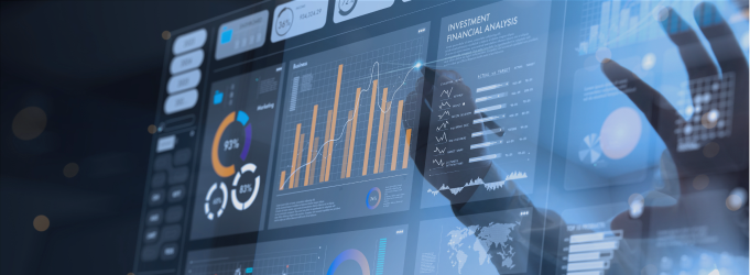
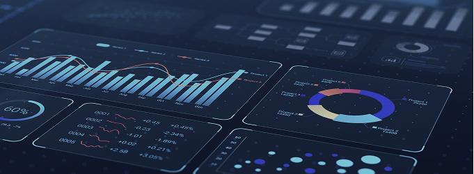
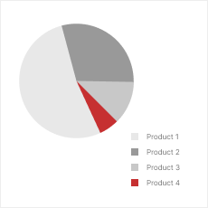
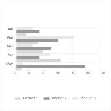
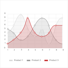
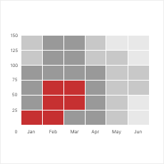
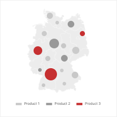
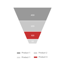
Tietojen visualisointipalvelut

Still wrestling with complicated spreadsheets? Innowise transforms buried insights into boardroom clarity through clear, interactive dashboards that help teams spot trends, reduce risk, and act faster than your competition.

100+

data projects delivered

60+

data visualization experts

80%

vanhempi ja keskitason asiantuntijat

Fixing slow report delivery
Late reports are useless for businesses, so we build auto-updating dashboards and pipelines that deliver insights when you need them, not hours later.
Scaling with growing data
Data’s piling up? Instead of patching performance, we redesign your model and establish an architecture that scales effectively without painful rework.
Enabling self-service insights
While some teams rely on analysts for every number, Innowise makes dashboards intuitive enough that even non-tech folks can dig in and find what they need.
Cleaning up messy integrations
Pulling info from dozens of standalone systems? We clean up the integration mess and build data layers that merge info into one reliable source of truth.
Restoring trust in reporting
Innowise helps you win users’ trust back. We add audit trails, calculation explanations, and test every logic layer, so your team can truly rely on the numbers.
Driving BI user adoption
No one uses clunky dashboards. So ours are fast, clean, and tailored to defined roles. Plus, we offer user guides to make adoption as painless as possible.

Innowise’s end-to-end data visualization services

  • Tietojen visualisoinnin konsultointi
  • Tietojen visualisoinnin toteutus
  • Tietoalustan kehittäminen
  • Räätälöidyt ohjelmistoratkaisut
  • Dashboard and report design
  • Visualisoinnin optimointi
  • Data visualization with cloud services

No dashboards? Or worse — ones no one uses? We help you start from zero or clean up the mess, building a clear, practical plan to turn raw data into reports with real business insight.

Tietojen visualisoinnin konsultointi

Tietojen visualisoinnin toteutus

Whether you need to pick the right stack or wire up real-time dashboards, Innowise’s team handles the hands-on work of making visualizations accurate and actually worth using.

Tietojen visualisoinnin toteutus

Tietoalustan kehittäminen

Experienced in tietotekniset ratkaisut, we build a solid foundation first, like pipelines and warehouses. Your visualizations pull from reliable data instead of mismatched sources.

Tietoalustan kehittäminen

Räätälöidyt ohjelmistoratkaisut

Need to go beyond off-the-shelf? We build custom data visualization apps with embedded dashboards that connect to your data and work exactly the way your users expect them to.

Räätälöidyt ohjelmistoratkaisut

Dashboard and report design

Cutting through the noise, we design and develop dashboards that are truly built for specific roles, updated in real time, and shaped by what people need to make data-driven decisions.

Dashboard and report design

Visualisoinnin optimointi

Already have dashboards but they’re slow, cluttered, or unused? Innowise’s data experts audit the solution, fix performance issues, and redesign with a focus on clarity.

Visualisoinnin optimointi

Data visualization with cloud services

As a certified AWS, Azure, and GCP partner, Innowise builds scalable, secure data visualizations using cloud-native tools and adjusts their logic to the realities of your business.

Data visualization with cloud services
Tietojen visualisoinnin konsultointi

No dashboards? Or worse — ones no one uses? We help you start from zero or clean up the mess, building a clear, practical plan to turn raw data into reports with real business insight.

Tietojen visualisoinnin toteutus

Whether you need to pick the right stack or wire up real-time dashboards, Innowise’s team handles the hands-on work of making visualizations accurate and actually worth using.

Tietoalustan kehittäminen

Experienced in tietotekniset ratkaisut, we build a solid foundation first, like pipelines and warehouses. Your visualizations pull from reliable data instead of mismatched sources.

Räätälöidyt ohjelmistoratkaisut

Need to go beyond off-the-shelf? We build custom data visualization apps with embedded dashboards that connect to your data and work exactly the way your users expect them to.

Dashboard and report design

Cutting through the noise, we design and develop dashboards that are truly built for specific roles, updated in real time, and shaped by what people need to make data-driven decisions.

Visualisoinnin optimointi

Already have dashboards but they’re slow, cluttered, or unused? Innowise’s data experts audit the solution, fix performance issues, and redesign with a focus on clarity.

Data visualization with cloud services

As a certified AWS, Azure, and GCP partner, Innowise builds scalable, secure data visualizations using cloud-native tools and adjusts their logic to the realities of your business.

Data visualization experts are just two clicks away

Where data visualization makes the biggest impact

  • Yritys
  • Valmistus
  • Supply Chain
  • Markkinointi ja myynti
  • Rahoitus
  • Recruiting & HR
  • Turvallisuus
  • Vähittäiskauppa
  • Verkkokauppa
  • Terveydenhuolto
  • Kuljetus

Get a top-down view of KPIs, team performance, and resource allocation across enterprise departments to drive aligned decision-making at every level.

  • Cross-departmental dashboards
  • Executive and team-level views
  • Reaaliaikainen suorituskyvyn seuranta
Yritys

Visualize production metrics, downtime, and quality control in real time to detect inefficiencies and optimize every shift.

  • Machine performance charts
  • Yield & defect tracking
  • Downtime & maintenance trends
Valmistus

Track goods, delays, and inventory in action with dashboards that surface disruptions, optimize routing, and improve delivery.

  • Route and delivery monitoring
  • Inventory flow dashboards
  • Supplier reports
Supply Chain

Unify campaign results, lead quality, and sales funnel metrics to spot what marketing strategies are working and how to push revenue higher.

  • Funnel and conversion charts
  • Channel performance tracking
  • Sales by region or rep
Markkinointi ja myynti

Monitor cash flow, margins, and forecasts in one place. Innowise turns complex financial processes into clear visuals for execs and investors.

  • Cash flow dashboards
  • Cost vs revenue breakdowns
  • Forecast vs actuals tracking
Rahoitus

Track hiring pipelines, turnover, hot vacancies, and team performance to help HR teams use smart visualizations, not dull monthly spreadsheets.

  • Hiring pipeline statistics
  • Employee retention trends
  • Workforce gaps analysis
Recruiting & HR

Visualize threat patterns, system vulnerabilities, and response timelines to neutralize risks before issues escalate.

  • Security risk maps
  • Vulnerability tracking reports
  • Incident response time
Turvallisuus

Analyze sales trends, product performance, and foot traffic by location to spot underperformers, optimize inventory, and plan promotions smartly.

  • Store and SKU-level dashboards
  • Regional sales heatmaps
  • Promotion tracking
Vähittäiskauppa

Monitor sessions, conversion rates, and churn in real time with dashboards that highlight exactly where your business is at.

  • User journey visualizations
  • Cart and checkout metrics
  • Revenue by channel
Verkkokauppa

Track patient flows, lab test turnover, and outcomes with visual reports to improve care quality, reduce wait times, and allocate resources effectively.

  • Patient volume dashboards
  • Staff utilization tracking
  • Outcome and readmission data
Terveydenhuolto

See route efficiency, fleet health, and fuel usage in a convenient report. Innowise’s team helps logistics teams operate faster and more cost-effectively.

  • Route and ETA dashboards
  • Vehicle diagnostics views
  • Fuel and cost breakdowns
Kuljetus
Katso kaikki Katso vähemmän

Tietojen visualisointimenetelmämme ja -tekniikkamme

  • Core insights
  • Process & change analysis
  • Geospatial & density mapping
  • Flows & relationships
  • Distribution & drivers
  • Hierarchical views
  • KPIs & multi-variable analysis
  • Flow & time-series trends

Core insights

Use clear visualizations to highlight what matters most: KPIs, totals, trends, and product comparisons.

piirakka

Piirakkakaavio

piirakka

Pylväsdiagrammi

piirakka

Viivakaavio

piirakka

Histogrammi

Process & change analysis

Map out progress, delays, and handoffs to see what’s holding up processes and what moves your business forward.

piirakka

Gantt-kaavio

piirakka

Vesiputouskaavio

piirakka

Aluekaavio

Geospatial & density mapping

Pinpoint where things are happening and visualize regional performance, traffic, or resource gaps.

piirakka

Lämpökartta

piirakka

Choropleth-kartta

Flows & relationships

Track conversion paths, drop-offs, or system dependencies to surface friction, influences, or weak links.

piirakka

Suppilokaavio

piirakka

Network diagram

Distribution & drivers

Spot outliers, clusters, and correlations using scatterplots, box plots, or matrices to understand what’s driving change and what’s just noise.

piirakka

Scatterplot

piirakka

Laatikko- ja viiksikaavio

piirakka

Korrelaatiomatriisi

Hierarchical views

Drill into nested categories with data visualization tools to see how specific parts contribute to your whole business.

treemap

Treemap

sunburst

Sunburst

KPIs & multi-variable analysis

Monitor key metrics in context with charts that balance depth and clarity. No critical indicators will go unnoticed.

piirakka

Bubble chart

piirakka

Gauge chart

Flow & time-series trends

Visualize how values shift over time, between stages or categories. These dashboards are ideal for everything from budget flows to customer experience metrics.

piirakka

Sankey chart

piirakka

Streamgraph

Core insights

Use clear visualizations to highlight what matters most: KPIs, totals, trends, and product comparisons.

Piirakkakaavio

Piirakkakaavio

Pylväsdiagrammi

Pylväsdiagrammi

Viivakaavio

Viivakaavio

Histogrammi

Histogrammi

Process & change analysis

Map out progress, delays, and handoffs to see what’s holding up processes and what moves your business forward.

Gantt-kaavio

Gantt-kaavio

Vesiputouskaavio

Vesiputouskaavio

Aluekaavio

Aluekaavio

Geospatial & density mapping

Pinpoint where things are happening and visualize regional performance, traffic, or resource gaps.

Lämpökartta

Lämpökartta

Choropleth-kartta

Choropleth-kartta

Flows & relationships

Track conversion paths, drop-offs, or system dependencies to surface friction, influences, or weak links.

Suppilokaavio

Suppilokaavio

Network diagram

Network diagram

Distribution & drivers

Spot outliers, clusters, and correlations using scatterplots, box plots, or matrices to understand what’s driving change and what’s just noise.

Scatterplot

Scatterplot

Laatikko- ja viiksikaavio

Laatikko- ja viiksikaavio

Korrelaatiomatriisi

Korrelaatiomatriisi

Hierarchical views

Drill into nested categories with data visualization tools to see how specific parts contribute to your whole business.

Treemap

Treemap

Sunburst

Sunburst

KPIs & multi-variable analysis

Monitor key metrics in context with charts that balance depth and clarity. No critical indicators will go unnoticed.

Bubble chart

Bubble chart

Gauge chart

Gauge chart

Flow & time-series trends

Visualize how values shift over time, between stages or categories. These dashboards are ideal for everything from budget flows to customer experience metrics.

Sankey chart

Sankey chart

Streamgraph

Streamgraph

Looking for a data visualization service provider you can trust?

What powers our data visualization solutions

BI- ja tietojen visualisointityökalut
  • QlikView
  • Datawrapper
  • Cognos
  • Apache Superset
  • Metabase
  • Redash
Kielet ja puitteet
Kirjastot
  • Matplotlib
  • Plotly
  • Seaborn
  • Plotnine / GGplot
  • Bokeh
  • Pygal
  • Geoplotlib
  • D3.js
  • Korkeat kaaviot
  • Chart.js
  • Fusion-kaaviot
  • Chartlist.js
  • Recharts
  • Google-kaaviot
  • Dash
  • Streamlit
  • ggplot2
  • R Shiny
DWH-palvelut ja tietokannat
  • Microsoft SQL Server
  • PostgreSQL
  • MongoDB
  • MariaDB
  • MySQL
  • Clickhouse
  • Neo4j
  • Redis
  • Aurora
  • Redshift
  • RDS
  • Snowflake
  • DocumentDB
  • Synapsi
  • Cosmo DB
  • Google BigQuery
  • Cloud Iso pöytä
Tietojen tallennus
  • Amazon S3
  • Amazon DynamoDB
  • Amazon DocumentDB
  • Azure Cosmos DB
  • Azure Blob-tallennustila
  • Azure Data Lake
  • Azure Tietotehdas
  • Google Cloud Tietovarasto
  • Memorystore
Big data
  • Apache Hadoop
  • Apache Spark
  • Apache Cassandra
  • Apache Kafka
  • Apache ZooKeeper
  • Apache HBase
Big Data- ja AI-päällikkö

For a complete picture of a project’s efficiency, some details are always missing. That’s why it’s important to collect and filter the information from different sources. It lets you understand all the branches of your company and notice what is profitable and what is loss-making. My team and I work with all data visualization platforms and applications, which have helped boost the performance of businesses worldwide.

Big Data- ja AI-päällikkö

Miksi valita Innowise datan visualisointiyritykseksi?

We don’t push generic tools, we build what fits your data, team, and pace. Innowise has worked with major enterprises and niche businesses to turn messy, underused data into daily decision power. As a data visualization solutions company, we focus on performance, long-term usability, and results for your business.

Miten työskentelemme tietojen kanssa

At Innowise, we craft an individual approach to your specific project and business to help you make the most of data analytics and visualization services. Usually, this is how the process looks like.

Collection
  • Connecting to all your data sources
  • Supporting APIs and databases
  • Gathering raw data
Puhdistus
  • Fixing data issues and duplicates
  • Standardizing values and formats
  • Flagging suspicious entries
Parsing
  • Restructuring complex data fields
  • Classifying data into categories
  • Converting dates, metrics, etc.
Filtering
  • Defining the relevant data
  • Excluding noise and test records
  • Trimming datasets
Visualisointi
  • Picking charts that fit the goal
  • Designing clear reports
  • Building real-time, interactive views
Improvement
  • Enhancing visualizations post-launch
  • Adding new filters
  • Customizing dashboards further

Mitä asiakkaamme ajattelevat

Polina Shuruba Partner Manager XPRT MINDS
XPRT MINDS -logo

"Innowise on yksi parhaista kumppaneistamme. He täyttävät aina päteviä ehdokkaita koskevat pyyntömme. Tiimi on erittäin ripeä."

  • Teollisuus IT-palvelut
  • Joukkueen koko 6 asiantuntijaa
  • Kesto 24 kuukautta
  • Palvelut HR-konsultointi, henkilöstön lisääminen
Dominik Märkl Johtaja OneStop Pro
OneStop Pro logo

"Kun on kyse painetilanteiden käsittelystä, Innowise on aina osoittanut taitonsa näiden tilanteiden hallinnassa. He tekevät tämän ymmärtämällä selkeästi odotetut tuloksemme, jotta voimme viedä liiketoimintaamme kohti kasvua ja asiakastyytyväisyyttä."

  • Teollisuus Rakentaminen
  • Joukkueen koko 7 asiantuntijaa
  • Kesto 36+ kuukautta
  • Palvelut Räätälöityjen ohjelmistojen kehittäminen
Stefania Basciu Toimitusjohtaja Topcon Maatalous
Topcon Agriculture logo

"Olemme enemmän kuin tyytyväisiä hedelmälliseen yhteistyöhömme Innowise:n kanssa, sillä he hoitavat tehtävät korkeiden vaatimustemme ja yritysstandardiemme mukaisesti ja tuottavat toivottuja tuloksia."

  • Teollisuus Konsultointi
  • Joukkueen koko 2 asiantuntijaa
  • Kesto 28 kuukautta
  • Palvelut Verkkokehitys

FAQ

Yes, absolutely. Innowise’s data analytics solutions visualize both historical trends and predictive outputs to help you understand what’s happening and what to expect. That includes integrating forecast models, confidence intervals, and possible scenarios right into your dashboards.

Static charts show a snapshot, and interactive ones let you explore. We typically recommend interactive dashboards because they support filters, drilldowns, and real-time updates. That said, Innowise builds static visualizations too when speed or simplicity is the priority. The choice depends on how often the data changes, and we’re here to help you select the right visualizations.

With a data visualization firm like Innowise, pretty much everything is on the table. We tailor visuals by user role, industry context, and decision-making habits. Whether you need embedded dashboards or mobile views, we’ve done it.

Our engineers start by untangling the chaos, building staging layers, cleaning the mess, and organizing what matters. Then we translate that into sleek visuals. As a data visualization company, Innowise is used to working with data sets from various systems, like ERPs, IoT software, and legacy apps.

Yes, we build them to. Innowise offers data science as a service and plugs in machine learning outputs, real-time scoring, and anomaly detection directly into your dashboards. You’ll see AI predictions, patterns, and risk signals in context, powered by tietotekniikka expertise.

Varaa puhelu ja saat kaikki tarvitsemasi vastaukset.

    Ota yhteyttä

    Varaa puhelu tai täytä alla oleva lomake, niin otamme sinuun yhteyttä, kun olemme käsitelleet pyyntösi.

    Lähetä meille ääniviesti
    Liitä asiakirjoja
    Lataa tiedosto

    Voit liittää 1 enintään 2 Mt:n tiedoston. Hyväksytyt tiedostomuodot: pdf, jpg, jpeg, png.

    Klikkaamalla Lähetä, annat suostumuksesi siihen, että Innowise käsittelee henkilötietojasi meidän Tietosuojakäytäntö antaa sinulle asiaankuuluvia tietoja. Antamalla puhelinnumerosi suostut siihen, että voimme ottaa sinuun yhteyttä puheluiden, tekstiviestien ja viestisovellusten kautta. Puhelu-, viesti- ja datahintoja voidaan soveltaa.

    Voit myös lähettää meille pyyntösi
    osoitteeseen contact@innowise.com

    Mitä tapahtuu seuraavaksi?

    1

    Kun olemme vastaanottaneet ja käsitelleet pyyntösi, otamme sinuun yhteyttä ja kerromme yksityiskohtaisesti projektin tarpeet ja allekirjoitamme NDA-sopimuksen luottamuksellisuuden varmistamiseksi.

    2

    Tutkittuaan toiveesi, tarpeesi ja odotuksesi tiimimme suunnittelee projektin ehdotuksen, jossa esitetään työn laajuus, tiimin koko, aika- ja kustannusarviot.

    3

    Järjestämme kanssasi tapaamisen, jossa keskustellaan tarjouksesta ja sovitaan yksityiskohdista.

    4

    Lopuksi allekirjoitamme sopimuksen ja aloitamme projektisi toteuttamisen heti.

    Tarvitsetko muita palveluja?

    nuoli